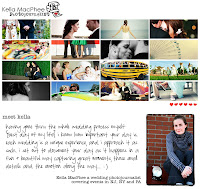
Today I asked my favorite Jersey Girl Photographer Kella MacPhee - check her out and prepare to be blown away - for some quick tips to better jewelry photographs. Kella says - Interesting + FAKE IT LIKE A PRO photos can be achieved in 3 steps! #1 Light. Turn that blinding automatic flash off! The built in flash on a camera is a photographer's worst enemy and will ruin any shot. Your best bet is to invest in a lightbox, they are not too much money and will ensure that you get even light and the proper white balance every time! {www.bhphotovideo.com} This will eliminate the need to fuss with camera settings before photographing your products each time.
 If you're saying to yourself, hey I'm a starving artist here, I don't have money for a fancy lightbox, but still want great photos try cheap, however unpredictable sunlight! Not as practical as the lightbox, but beautiful none the less. Some examples would be the soft and diffused light of a window {try setting up a table with your art next to a window} another option is venturing outdoors. Two rules to keep in mind: first you stay out of that midday sun- your photos will have harsh shadows and be blown out! {even your jewelry does not like to look pasty} {early morning and late afternoon are best} and 2. when shooting outside in light other than those great early morning hours and the "magic hour" before sunset, look for even shade, there is nothing worse than mottled light. Using light properly will ensure you have clean, evenly lit, pro looking pics!
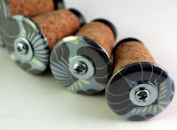
 #2. Angle. Change your angle. Eye catching photos are created by thinking outside the box. Long gone are the days when photos need to be shot straight on.. so 1992 and so boring! Try setting your camera down and shooting at the same level as the product. Another technique is to shoot up at the product... creating some drama. Shooting straight down and I mean straight down, get your butt up on that chair can also be interesting and modern. Play around and have fun, look at some of your favorite sellers and see what it is about them that is catching your eye.
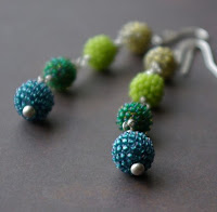
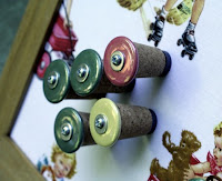 #3. Composition. Think outside the center. Centered images are boring! Negative space is king! Try placing your product on the left side and leaving the right side empty. Interesting photos are not always achieved by filling up space. Leaving room for your products to breathe can create these artistic + pro images you're after. Check out these beautiful photos by lilfishstudios and tqbdesigns.
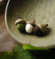 Another method is layering, now this is where it gets technical, for all you point and shooters out there cover your eyes. Gosh darn it control that depth of field if using a manual camera, think larger apertures like 2.8 or 4 {I know these seem like small #'s, but they really are large and let in more light, creating only a small portion of the image in focus.. yada, yada} by using a shallower depth of field and being in control over what you decide you want in focus, you will instantly have more professional pics. So show a variety of pics on your page, but maybe one can have a the pendant of your necklace in focus while the chain is not. Some of the most interesting photos are only parts of subjects, leaving the viewer intrigued or an interesting composition allowing your eye to move around the image.
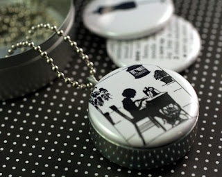 REMEMBER you are artists appealing to creative buyers .. this is not ebay.. the first thing people see is the photos.. be creative and HAVE FUN!


1 comment
Sound tips, and I adore those little acorns!!! ;)
Post a Comment